• Sign up or login, and you'll have full access to opportunities of forum.

Bobnearled = Bobinder

Go to CruxDreams.com
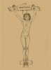
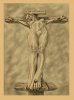
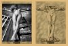
Second attempt to repost. This poor girl was unable to express any final words due to the discomfort of the garrote around her throat. Instead she resorted to the most obscene gesture of which she was capable as a final comment on the judiciary which found her guilty of piracy and sentenced her to death. 'Viva el desafío!'
 

Attachments

  • bbdd6 (b archive) Pyracie 10a.jpg
    bbdd6 (b archive) Pyracie 10a.jpg
    1.5 MB · Views: 287
Seditio Sicarii 3

The inspiration for this drawing began, unusually, with the well known topless photo of the young Patricia Highsmith. This American author of the Ripley novels was born in 1921 and died in 1995. Like her older contemporary, Virginia Woolf, she suffered from depression and both were pioneers of early twentieth century women's fiction in an age when lesbianism was frowned upon. A recent posting on The Femlash Thread refers to Highsmith as, "attractive (tall, dark, mysterious, with feral good looks), very intelligent, and brilliant [but] racist, anti-semitic, cruel, misanthropic, and sadly a misogynist. Improper nourishment, emotional turmoil, and alcoholism took its toll on her."

My picture is not intended as a portrait but I like to think that the atheistic subject, something of a social reject who responded largely by rejecting society, might have approved of such a development of her 'tortured soul' image. I might even have considered the title, 'Saint or Sinner?' Whether or not the photograph implies any commentary on religion, it was likely to be deliberately shocking within the context of the 1940s portrait genre.

Having thus set my conscience at ease, I relied on imagination to create everything above the elbows and below the waist. presenting a pose with the knees locked out to take the pressure off the arms. The result is a study suitable for a painting. Consequently there is no attempt at background detail or bloodstains and I have not adopted the dramatic lighting which provides the arresting chiaroscuro of the original image. I think this has considerable artistic merit and if anyone can post a better reproduction, I would love to see it. Meanwhile my proposed painting has not materialised. Maybe one day...
 

Attachments

  • bb12-1 (d archive) Seditio Sicarii 3.jpg
    bb12-1 (d archive) Seditio Sicarii 3.jpg
    465.6 KB · Views: 239
  • bb12-2 (d archive) Seditio Sicarii 3.jpg
    bb12-2 (d archive) Seditio Sicarii 3.jpg
    634.4 KB · Views: 257
An interesting challenge there, Bob, seeing if anyone else wants to try to make a better reproduction. I might take it up, but... this is one of my favorite early sketches from you. I had no idea about the portrait or the person, it's a fascinating use of history. Maybe try that painting? Just try to make her face more like it is in the phitograph, because she is just gorgeous!
 
An interesting challenge there, Bob, seeing if anyone else wants to try to make a better reproduction. I might take it up, but... this is one of my favorite early sketches from you. I had no idea about the portrait or the person, it's a fascinating use of history. Maybe try that painting? Just try to make her face more like it is in the phitograph, because she is just gorgeous!
Hi Em, I think I may be causing some confusion - if anybody can find a better reproduction of the original Pat Highsmith photo, I would like to see it - the one in my post looks like a newsprint reproduction. I'm not so over-confident about somebody producing a better drawing! I remember you commenting favourably on this one of mine on Deviantart - thanks. She was beautiful in her youth, but her publisher once said of her, "the face you have in your twenties is the one you are born with but the face you have in your fifties is the one you deserve!" Poor Patricia seemed to lose her looks with her social tolerance. The world made her angry and she was angry with the world, and probably in a lot of pain.
 

Attachments

  • PH1 MTM1MjA3NjY0NTQzMTExNjQ2.jpg
    PH1 MTM1MjA3NjY0NTQzMTExNjQ2.jpg
    276.4 KB · Views: 125
  • PH2 151130_r27351-1200x630-1447952588.jpg
    PH2 151130_r27351-1200x630-1447952588.jpg
    97.6 KB · Views: 100
  • PH3 Patricia-Highsmith-012.jpg
    PH3 Patricia-Highsmith-012.jpg
    185.2 KB · Views: 94
  • PH4 PatriciaHighsmith.jpg
    PH4 PatriciaHighsmith.jpg
    71.5 KB · Views: 105
Hi Em, I think I may be causing some confusion - if anybody can find a better reproduction of the original Pat Highsmith photo, I would like to see it - the one in my post looks like a newsprint reproduction. I'm not so over-confident about somebody producing a better drawing! I remember you commenting favourably on this one of mine on Deviantart - thanks. She was beautiful in her youth, but her publisher once said of her, "the face you have in your twenties is the one you are born with but the face you have in your fifties is the one you deserve!" Poor Patricia seemed to lose her looks with her social tolerance. The world made her angry and she was angry with the world, and probably in a lot of pain.
Is this better than the one you posted Bobinder? Does this help you?
image.jpeg
 
Last edited:
Is this better than the one you posted Bobinder? Does this help?
View attachment 400234
Thank you - it certainly is! Well done, you didn't waste any time either! Maybe I shall do that painting after all. Meanwhile, I just think it's a fantastic portrait. I don't know when the photo was first published but it must date from about 1940 and the lighting is too perfectly dramatic to be a candid. She was outrageous enough to want to pose for it and angry enough to want to offend people with it. Whilst her social hatred disappoints me, part of me admires the guts she had to express herself, and as Em has rightly said, in her youth she was "just gorgeous!"
 
Thank you - it certainly is! Well done, you didn't waste any time either! Maybe I shall do that painting after all. Meanwhile, I just think it's a fantastic portrait. I don't know when the photo was first published but it must date from about 1940 and the lighting is too perfectly dramatic to be a candid. She was outrageous enough to want to pose for it and angry enough to want to offend people with it. Whilst her social hatred disappoints me, part of me admires the guts she had to express herself, and as Em has rightly said, in her youth she was "just gorgeous!"
Glad I could help. Yes she was very beautiful in her youth, now I am interested in learning more about her. She seems to have been a very interesting, and complicated person.
 
Glad I could help. Yes she was very beautiful in her youth, now I am interested in learning more about her. She seems to have been a very interesting, and complicated person.
I think it would be fair to say she was interesting and complicated. If you have formed that opinion solely from these last few posts, I believe I am not being unfair to her. Her novels were dramatised and 'The Talented Mr. Ripley' starring Matt Damon, is probably the best known film based on her books. I discovered her a few years back when I chanced upon her biography in a second-hand/charity shop. When I saw her beautiful young face on the cover, I flicked through and found the topless portrait, happily paid the price, went home and read it - a sad story well told. I think it was 'Beautiful Shadow: A Life of Patricia Highsmith by Andrew Wilson.
 
I love Ripley, he's a brilliant creation, an attractive but quite amoral psychopath. You are drawn into his world, under his spell, and always shocked when the suave outer shell gives way momentarily to short bursts of extreme violence.

Highsmith herself was quite a difficult person by all accounts, alcoholic and unable to sustain relationships over the long term. Amusing, talented, flawed. Such is art. We have discussed her here before, but I don't remember where.

I'm glad Hondo was able to find that pic for you Bob, I've got in somewhere but now I don't have to look for it!

But now I'm thinking of using it in something myself. Hmm :)
Excellent - I found the picture inspiring as soon as I saw it. I shall look forward to seeing what you create (and it sounds like mp5stab might be planning a version too!)
 
Seditio Sicarii 8 after Urban Friday

The original image which inspired 'Seditio Sicarii 8' was a very small reproduction of a postage stamp design bearing a frank mark and the scripts 'Urban Friday' and 'Republic of Eire'. I have searched the internet recently but cannot find this small postage stamp, and unfortunately I do not recall where I first saw it. The first image here is a detail from the centre of the stamp illustration, which is in higher resolution than the one I first saw. I was unable to find any accompanying explanation relating to it, so whether it was a political comment on the fate of the Irish Republic or an album cover design for a band named Urban Friday, I have no idea. Perhaps somebody can enlighten me and post the complete original?

Even in a small size the image has great visual impact, with the low viewpoint forcing the architectural perspective of the background into steep diagonals. Perhaps the message is that the beauty of the Emerald Isle has been sacrificed in the interests of urban development? The resulting effect of foreshortening in the figure is dramatic - the feet appear much larger than the head and because we are looking underneath the breasts, the nipples emerge above the shoulders. The only element lacking here is a sense of large scale to do justice to the visual drama. But this was before I owned a computer. I only had the small printed reproduction, and any attempt to enlarge it on a photocopier merely exaggerated the pixels and made it look worse.

Undeterred, I decided it was a good source for an interpretative drawing, in which I could include the fine detail which was absent from the original. My blurry, poor quality enlargement would provide a starting point for an A4 pencil drawing. Whilst a foreshortened view of the human figure is something we see every day (e.g. every time you stand up and look down at your feet) translating this into a drawing means overcoming the brain's desire to show the various parts of the human body in correct proportion. Early artists tended to avoid foreshortened figures because they were difficult and we only begin to see convincing ones in the Renaissance period. Frankly, without a life model or the Urban Friday image as a guide, I would have found the progressive three-dimensional foreshortening a serious challenge to my draughtsmanship.

For the third comparitive image, I have enlarged Urban Friday nearly 400% in soft focus, which appears acceptable until you zoom in close. Here you will see my alterations to the feet to allow for single nailing, and other modifications such as perspiration gloss and bloodstains. The urban background is a disturbingly contemporary setting (making a powerful statement in its own right) which I decided to ignore for simplicity's sake and in the interests of a timeless atmosphere. With the addition of a titulus, my figure was ready to join her equally unfortunate sisters in the embryonic Seditio Sicarii series.
 

Attachments

  • bbuf-1 Urban Friday 378461_304181046274357_1494765883_n (1).jpg
    bbuf-1 Urban Friday 378461_304181046274357_1494765883_n (1).jpg
    106.8 KB · Views: 207
  • bbuf-2 (d archive) Seditio Sicarii 8 after Urban Friday.jpg
    bbuf-2 (d archive) Seditio Sicarii 8 after Urban Friday.jpg
    1.8 MB · Views: 200
  • bbuf-3 Seditio Sicarii 8 - Urban Friday.jpg
    bbuf-3 Seditio Sicarii 8 - Urban Friday.jpg
    2.5 MB · Views: 191
But, Bobinder, it could be better to post your work in thumbnails : so, when we're opening, we could see them entirely ...;)
 
Seditio Sicarii 8 after Urban Friday

The original image which inspired 'Seditio Sicarii 8' was a very small reproduction of a postage stamp design bearing a frank mark and the scripts 'Urban Friday' and 'Republic of Eire'. I have searched the internet recently but cannot find this small postage stamp, and unfortunately I do not recall where I first saw it. The first image here is a detail from the centre of the stamp illustration, which is in higher resolution than the one I first saw. I was unable to find any accompanying explanation relating to it, so whether it was a political comment on the fate of the Irish Republic or an album cover design for a band named Urban Friday, I have no idea. Perhaps somebody can enlighten me and post the complete original?

Even in a small size the image has great visual impact, with the low viewpoint forcing the architectural perspective of the background into steep diagonals. Perhaps the message is that the beauty of the Emerald Isle has been sacrificed in the interests of urban development? The resulting effect of foreshortening in the figure is dramatic - the feet appear much larger than the head and because we are looking underneath the breasts, the nipples emerge above the shoulders. The only element lacking here is a sense of large scale to do justice to the visual drama. But this was before I owned a computer. I only had the small printed reproduction, and any attempt to enlarge it on a photocopier merely exaggerated the pixels and made it look worse.

Undeterred, I decided it was a good source for an interpretative drawing, in which I could include the fine detail which was absent from the original. My blurry, poor quality enlargement would provide a starting point for an A4 pencil drawing. Whilst a foreshortened view of the human figure is something we see every day (e.g. every time you stand up and look down at your feet) translating this into a drawing means overcoming the brain's desire to show the various parts of the human body in correct proportion. Early artists tended to avoid foreshortened figures because they were difficult and we only begin to see convincing ones in the Renaissance period. Frankly, without a life model or the Urban Friday image as a guide, I would have found the progressive three-dimensional foreshortening a serious challenge to my draughtsmanship.

For the third comparitive image, I have enlarged Urban Friday nearly 400% in soft focus, which appears acceptable until you zoom in close. Here you will see my alterations to the feet to allow for single nailing, and other modifications such as perspiration gloss and bloodstains. The urban background is a disturbingly contemporary setting (making a powerful statement in its own right) which I decided to ignore for simplicity's sake and in the interests of a timeless atmosphere. With the addition of a titulus, my figure was ready to join her equally unfortunate sisters in the embryonic Seditio Sicarii series.
This is a very striking image Bobinder.
image.jpeg I really like it.
Your drawing is fantastic, great work. It is interesting finding out what the inspirations are for your artwork.
image.jpeg
I tried looking for the stamp on the net, and came up empty.
 
This is a very striking image Bobinder.
View attachment 410261 I really like it.
Your drawing is fantastic, great work. It is interesting finding out what the inspirations are for your artwork.
View attachment 410262
I tried looking for the stamp on the net, and came up empty.
Thank you, and thanks for looking - it must be out there somewhere. Perhaps 'Urban Friday' is some kind of veiled reference to Good Friday?
 
Indeed there are numerous possible connotations, including this image:-

"When Black Friday comes I'll be on that hill
You know I will"

From 'Black Friday' by Steely Dan 1975

(And what would we expect to find on 'that hill'?)
A hill of 100 crosses like the ones on Tree's spread:devil::p
And, that is a great song by Steely Dan!

"When Black Friday comes
I'll stand down by the door
And catch the grey men when they
Dive from the fourteenth floor"
:devil:
 
Fascinating. Many - perhaps most - of the 20th century writers I admire for their writing (mainly poets, I read more poetry than novels, but I think it's true of both) came out with some unpleasant, even downright toxic, political and social opinions. I don't ignore them, but I think it may be that highly creative people bring out more of their dark side than most of us - it may be a kind of necessary 'exhaust', when they're not in 'genius' mode, and it gets expressed in some horribly twisted forms. And in some cases, PH was surely one, the battle between the tortured darkness and the imaginative brilliance became overwhelming.
 
Back
Top Bottom